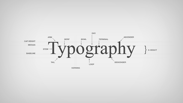
Having been brought up in this industry before computers were all the rage I had to learn to hand letter type creating serif, san-serif and script type based on type that was in a book. I was taught that punctuation was a secondary visual and to treat the type as if there were no punctuation so the weight of the headline was either visually centered or at least fully aligned when flush left.
It seems that this is a lost art, particularly as it pertains to the digital space. It is difficult to code for tight kerning and hanging quotation marks, though. But in general, this seems to be the one thing that I have continuous edits for with most young art directors. I'm not even sure it's being taught. It's like cursive being dropped from middle school. But it's necessary and essential to good design. And it's worthy of learning even if you have to teach yourself.
If you really want to get to know typography, I recommend taking a graphic arts course. You'll actually learn what leading is and how to use metal spacers to create letter spacing (kerning). It's not for everyone, though. And if it's not for you, then at least try learning via online resources.
Just please don't make me look at your period sitting way over by itself, alone and afraid.


